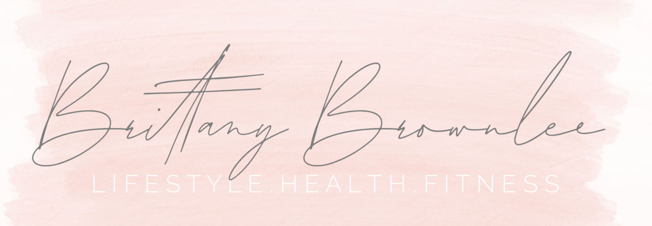
New logo alert! I cannot lie, this was a bit more challenging than I expected. I wanted a logo that was simple, but versatile enough to be able to use it on different social medial pages. I also wanted it to fit well with my blog page, which has a similar style to what you see above. Personally, I am drawn to the simple and clean designs. Though this goes against much of what we are taught, I actually am drawn more to simplicity and neutral color tones.
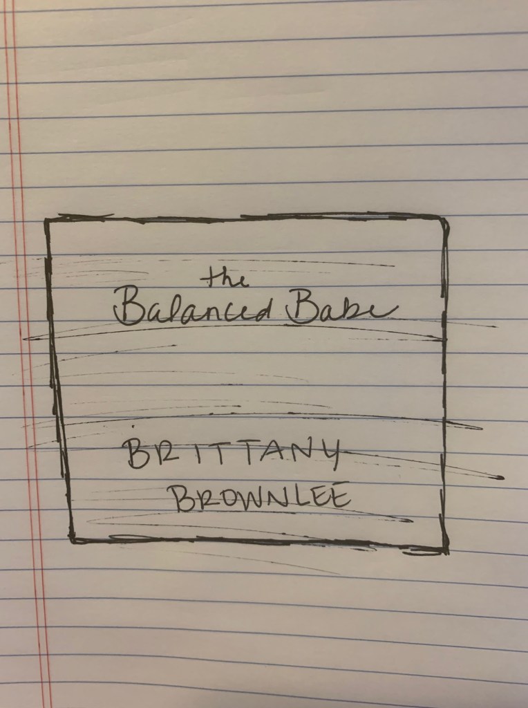
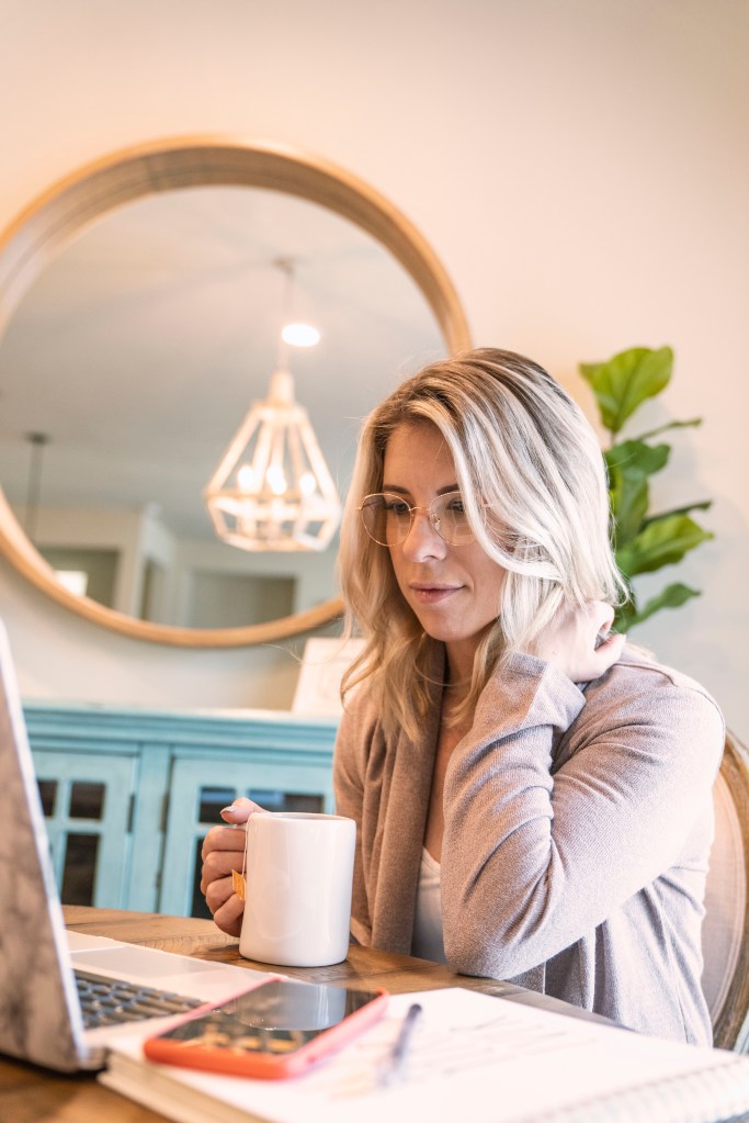
Since my primary topic of my blog is living a balanced and healthy lifestyle, I wanted to do something that was clean, but also a little fun. The phrase, “the balanced babe” popped into my head, and I thought it fit my blogging style well. The blush pink watercolor is something I pulled from my headline photo. It was important to me to incorporate the same visual “feel” of my logo, as the rest of my media pages.
When I started sketching my ideas on paper, Pinterest became my best friend. I searched for different font ideas, as well as different shapes for the logo. I decided to go with the square because it seemed clean and more modern than other shapes I was seeing. I am still struggling a bit with the font, but I like the idea of mixing a cursive font with a clean and modern font. Again, simple and clean is my goal, but the cursive gives a little more character and interest to the image.
Now, lets just take a moment to chat about how many times I completely erased the start of this project in Adobe….it’s embarrassing! After more attempts than I would like to admit, I finally got the ball rolling on something that looked like what I had pictured in my head. I started with the watercolor image as my background. I then created the rectangle shape and edited the stroke and colors. That’s when my hunt for the perfect font began. I searched for a while, looking for a “modern swoopy cursive”, whatever that means. I ended up downloading a few different fonts within Illustrator to try them out, and settled on this one. As mentioned before, I am still not sold on the cursive at the top, but think it’s a good start. Finally, I cropped the image to make it more optically pleasing and easier to work with.
I will mention that I feel as though something is missing from the middle of the logo. Initially, I liked the idea of having an open space in the middle, but I do think it looks a little bare. Overall, I am happy with my first draft…things can only go up from here!