New logo alert! I cannot lie, this was a bit more challenging than I expected. I wanted a logo that was simple, but versatile enough to be able to use it on different social medial pages. I also wanted it to fit well with my blog page, which has a similar style to what you see above. Personally, I am drawn to the simple and clean designs. Though this goes against much of what we are taught, I actually am drawn more to simplicity and neutral or pastel color tones.
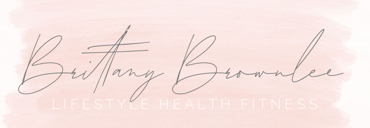
Since my primary topic of my blog is living a balanced and healthy lifestyle, I wanted to do something that was clean, but also a little fun. The phrase, “the balanced babe” popped into my head, and I thought it fit my blogging style well. The blush pink watercolor is something I pulled from my headline photo. It was important to me to incorporate the same visual “feel” of my logo, as the rest of my media pages.
When I started sketching my ideas on paper, Pinterest became my best friend. I searched for different font ideas, as well as different shapes for the logo. I decided to go with the square because it seemed clean and more modern than other shapes I was seeing. It was important to me to keep this image as clean and simple as possible. The primary part of my blog is keeping life simple, which allows balance when life gets crazy.
Now, lets just take a moment to chat about how many times I completely erased the start of this project in Adobe….it’s embarrassing! After more attempts than I would like to admit, I finally got the ball rolling on something that looked like what I had pictured in my head. I started with the watercolor image as my background. I then created the rectangle shape and edited the stroke and colors. That’s when my hunt for the perfect font began. I searched for a while, looking for a “modern swoopy cursive”, whatever that means. I ended up downloading a few different fonts within Illustrator to try them out, and settled on this one. As mentioned before, I was not sold on the cursive at the top. After an absurd amount of time scrolling through various fonts, I finally found it….”Mina Regular”! I like that this font is cleaner and has a little more personality than the original cursive font I fount. Finally, I decided to fill the empty space in the middle with a barbell I created using the rectangle tool, and rounded corners options. I wanted to keep this part light and airy, while also symbolizing ‘strength’ and of course, exercise. Using the gradient tool, I made a softer look with a fade from white to light grey, and created a 2pt white stroke around the shapes.
Overall I am pretty happy with my logo. I think it pairs well with my blog and other social media pages, and could even be used as part of the intro to a YouTube video. I believe the blush tones of the watercolor, modern fonts, and barbell bring an overall feeling of simplicity, health and balance to the viewer’s attention. I had a great time creating this piece, and look forward to using these learned skills in future projects!
