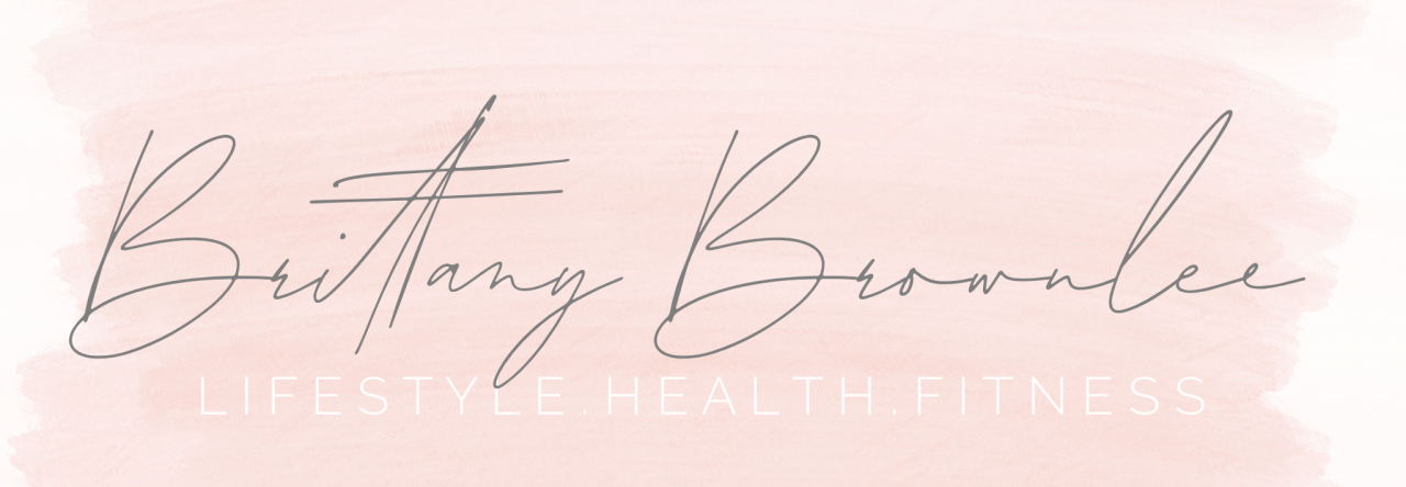
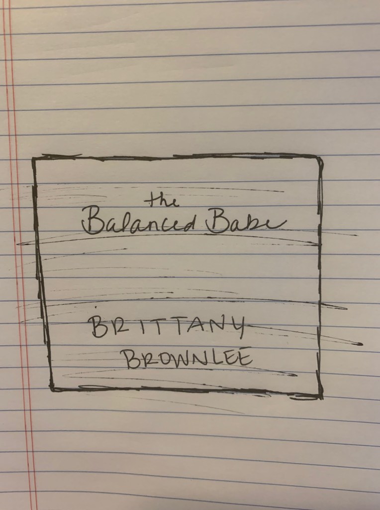
This is a very simple sketch I drafted for my blog logo. I tend to lean toward the clean and simple side of design, especially when it comes to my blogging or social media. I thought the phrase “the balanced babe” was fun because it goes well with the “b” trend of my name, but also fits with the theme and overall vibe of my page. The shading in the background will be a soft watercolor stroke, which matches the headline photo on my home page. I’m sure I will add a bit more to this when I draft it up, but I like the idea so far!
